
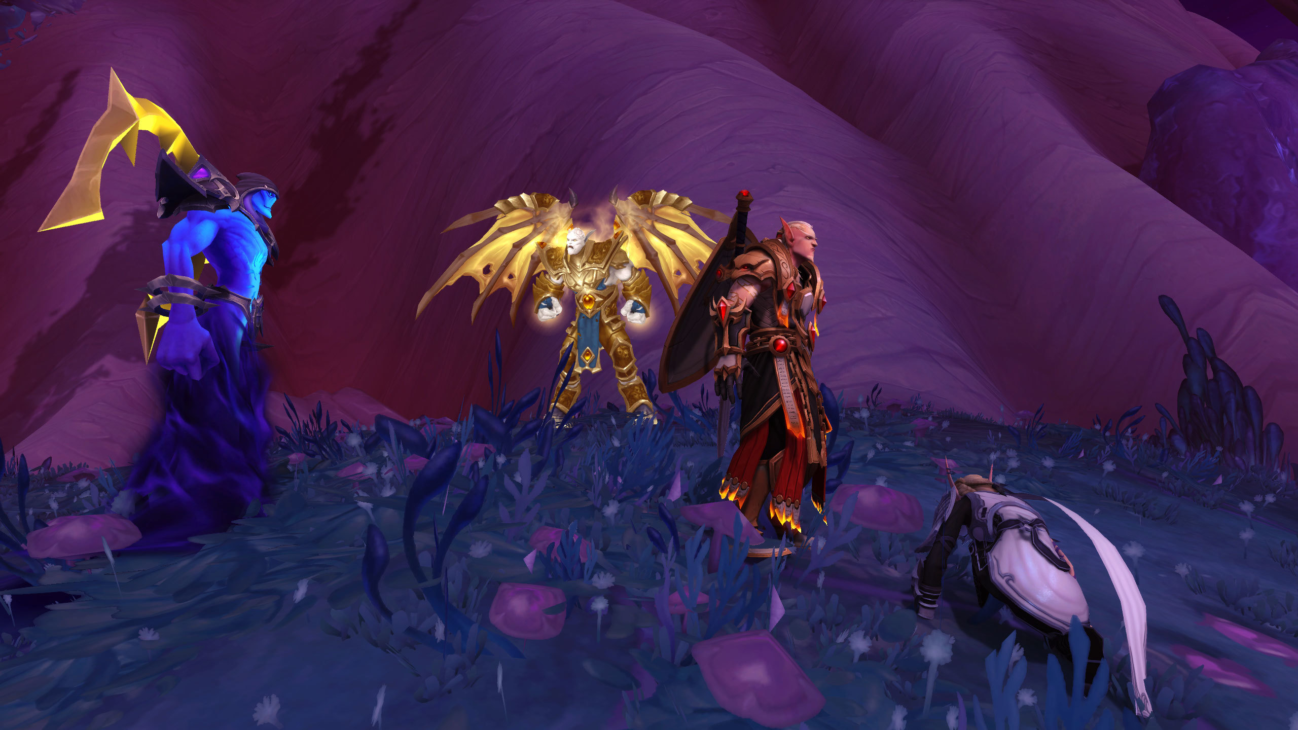
In the frantic heat of a raid boss encounter, there is no time to read instructions. World of Warcraft’s ability to communicate complex, lethal mechanics through pure visual language is one of its most impressive design feats. By using a consistent vocabulary of color, shape, and motion, the game teaches players how to survive without ever needing to pause the action. This guide breaks down the visual syntax that makes Azeroth’s combat legible, fair, and ultimately masterable.

The Syntax of Danger
The visual language of Warcraft combat relies on immediate, instinctive associations. For example, the use of “Fel Green” or “Void Purple” has been established over years of play as a signal for specific types of magical danger. When a player sees these colors on the ground, the brain doesn’t need to process the lore—it simply registers “avoid.” By keeping these color associations consistent across every expansion, the game creates a permanent library of “threat signals.” Players don’t have to learn a new language for every raid; they just need to recognize the established grammar.

Shape and motion provide the second layer of this syntax. A circular area-of-effect (AoE) is almost always a “soak” or a “bomb” mechanic, while linear, cone-shaped projections warn of a “breath” or “cleave” attack. The motion of these abilities is just as vital; an ability that “telegraphs” its arrival—a boss winding up a heavy strike or a circle slowly expanding on the ground—gives the player a window to react. This predictability is the foundation of fairness. It transforms the boss from an unpredictable chaotic force into a rhythmic puzzle that can be danced around, provided the player is observant enough to read the boss’s physical language.
Visual Cues of Combat
| Signal Type | What it Communicates |
|---|---|
| Color Hue | Damage type or threat source (e.g., Fel vs. Arcane). |
| Geometric Shape | Nature of the attack (e.g., Cone vs. Circle). |
| Animation Wind-up | Temporal warning for reaction. |
| Particle Density | Severity of the incoming damage. |
The Player as a Reader of Patterns
This visual communication is what separates a chaotic screen of effects from a readable game. When you master these cues, the game stops looking like a collection of messy graphics and starts looking like a sequence of patterns. You stop watching the “art” and start watching the “warnings.” This transition is the hallmark of a skilled player; you have decoded the visual language, and the combat becomes a dialogue between your reaction and the boss’s animation.
The Sustainability of Style

Because these visual rules are so fundamental, they allow the game’s art style to be updated without breaking the player’s ability to play. High-definition particles can be added, but as long as a “Void Purple” circle remains a “Void Purple” circle, the game remains understandable. This consistency is why WoW feels just as playable today as it did a decade ago, proving that clear visual syntax is far more valuable than raw graphical fidelity.
Leave a Reply